
A two-dollar quick pick and a set generated by a subscription-based AI lottery analysis tool take about the same five seconds to produce — the difference is that one comes with a confidence score, a colored chart, and marketing copy promising predictive modeling has found an edge in the draw history. After six months running three of these Powerball strategy platforms against every real drawing, side by side with a plain spreadsheet, I can say the two sets land in roughly the same place. That's the myth worth correcting here: the idea that wrapping a random Powerball draw in a neural network produces something meaningfully different from a quick pick with better branding.
My interest in this started with an ordinary office Powerball pool and a hunch that some balls show up more than others. Before I touched any AI platform, I tried the cheapest possible fix — a random number generator app pulled straight from the App Store, the kind that spits out six digits and calls itself a system. It performed exactly like flipping a mental coin at the register, which told me nothing except that the app wasn't doing anything an app doesn't already do by default (my wife calls the whole habit excessive, and she's not wrong).
Quick Pick vs. AI Pick: The Predictive Modeling Sales Pitch
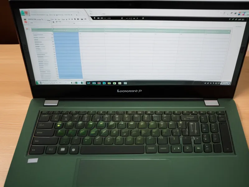
Vendors selling these platforms lean hard on words like machine learning and pattern recognition, and it's easy to assume a computer chewing through years of draw history must be finding something a person can't see. It isn't. Powerball draws each of its balls independent of every draw before it, and the underlying probability of matching the jackpot sits at 1 in 292,201,338 whether or not a dashboard says "high confidence." I get into the full structure of the tracking file I use to check that claim in an earlier post about how I built a master spreadsheet to audit my AI lottery predictions, if you want the tab-by-tab version.
Why One Near Miss Isn't Proof of Anything
I still remember the night one of the tools got uncannily specific. I was standing at the stove waiting for a pot of water to come to a boil, half paying attention to my phone, when a push notification flagged a set the app was "highly confident" about. Two days later, the actual drawing matched three of those five white balls. For about ten minutes I felt like I'd stumbled onto something. Then I ran the math on how many sets that tool actually generates in a given week, and the feeling passed.
That's the mechanism behind almost every glowing review you'll find for these platforms: a screenshot of one near miss from whatever neural network produced it, shared without the hundreds of misses that came before it. A tool generating a few hundred lines a month is statistically guaranteed to produce an occasional three-of-five match — that's ordinary variance, the same way a room full of people flipping coins will always turn up someone with five heads in a row. The confidence score on the screenshot isn't proof of anything. It's marketing dressed up as data visualization.
So here's the corrected rule I'd actually stand behind: before trusting a near-miss screenshot from any lottery app, ask what the denominator is. How many total lines did that tool generate that week, that month, that six-month stretch? One flagged hit out of five lines means something different than one hit out of five hundred, and vendors almost never show you that second number.

Reading the Six-Month Data Straight
Not all of the tracking happens on a screen, either. Once a month or so I print the draw history and go through it with a highlighter, marking each actual hit by hand — a small, deliberately slow habit that a spreadsheet's auto-formatting can't replace, if only because dragging a highlighter down a column forces you to actually look at every row instead of trusting a formula to summarize it for you.
A friend from the Charlotte data meetup, Kelsey Tatum, asked me for a copy of the tracking spreadsheet after I mentioned the project one evening, and the questions that followed were never about whether I'd won anything — they were about sample size, and how I define a near miss in the first place. That's the right instinct. I've written before about the spreadsheet that annoyed my wife, and the highlighter habit is really the analog version of the same obsession. My neighbor, who spends most weekends homebrewing IPAs in his garage, teases me about it the same way I'd tease him about obsessing over fermentation temperatures, and the comparison holds up better than either of us would like to admit.
Across the full six-month stretch, the three platforms combined didn't clear the plain statistical baseline by any margin worth calling meaningful. Hit rates for matching three of five white balls hovered close to what you'd expect from unweighted random draws, not because the tools are outright scams, but because there's no legitimate way to weight future draws using past ones. It's the lottery equivalent of a stock screener that backtests beautifully and then does nothing special going forward, or a weather model that nails last week's storm and still can't call next Tuesday.
What This Article Won't Settle
There's a longer list of related questions I'm deliberately not answering in this piece: how draw-frequency analysis actually gets calculated, why I think hit-rate tracking matters more than a demo screenshot, the hot-versus-overdue number debate, whether tweaking a quick pick counts as real optimization, the tool-versus-spreadsheet argument, whether a subscription is worth it against a free spreadsheet, wheeling systems built to cover more combinations, the red flags that separate a legitimate tool from a shady one, how Powerball's matrix differs from other draw games, backtesting a model against years of history, stacking any tool's picks against a plain random baseline, and the running total of what six months of subscriptions and tickets actually costs. I go deeper into the pattern side of that list in a data analyst's half-year experiment tracking AI patterns in the Powerball, but the short version is that a pattern found after the fact isn't the same as a pattern that predicts anything.

What These Tools Are Actually Good For
What these platforms are actually good for isn't prediction. It's data visualization — turning years of draw history into a chart that makes the sheer scale of randomness harder to ignore, and giving someone like me a structured place to log a habit instead of scribbling numbers on the back of a receipt. Treat the confidence score as a novelty, treat the chart as entertainment, and the tools stop being disappointing, because you stop expecting them to do something no software can actually do.
None of this makes AI lottery analysis worthless, and none of it makes Powerball strategy a real thing you can optimize your way into. The corrected version of the pitch is smaller and less exciting than the sales page: these tools organize a random process, they don't outsmart it. If you're going to spend real money finding that out, go in knowing it up front, and keep it within whatever you'd happily lose on any other hobby.
The information on this site is based on personal experience and research for informational purposes only. It is not a substitute for professional medical, financial, or legal advice. Always consult a qualified professional before making decisions that affect your health or finances.